What is a Grid


A grid is the invisible structure that keeps your layout clean and organized. It builds hierarchy, improves readability, and makes designs easier to process.
Even if you don’t see the grid in the final design, breaking its rules, even slightly, can throw things off (as you can see in Example A above). That’s the difference between good and great design. Setting your grid early helps create consistency and speeds up the whole process.
What I’m about to share is my go-to method for designing in Figma, Framer, and Webflow. It’s worked well for me, and for the developers I’ve teamed up with. Clear, structured designs mean less back-and-forth and smoother development.
Let’s start with the basics.
The Base-line Grid
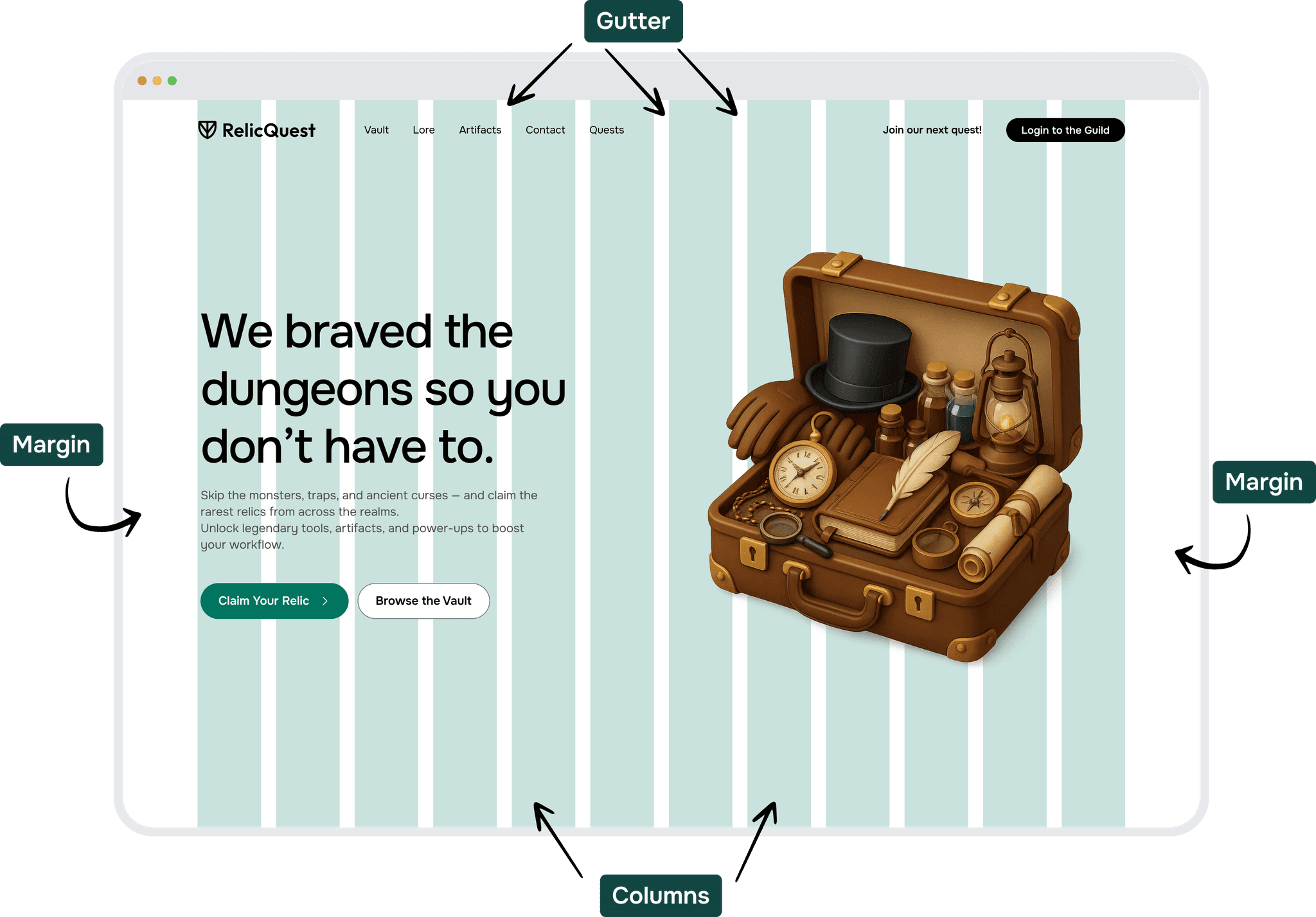
Column Grid – A layout system that splits a screen into vertical columns, helping align and organize elements consistently.
Baseline Grid – A set of horizontal lines that creates vertical rhythm, mostly used for aligning text or complex layouts like icons and dashboards.
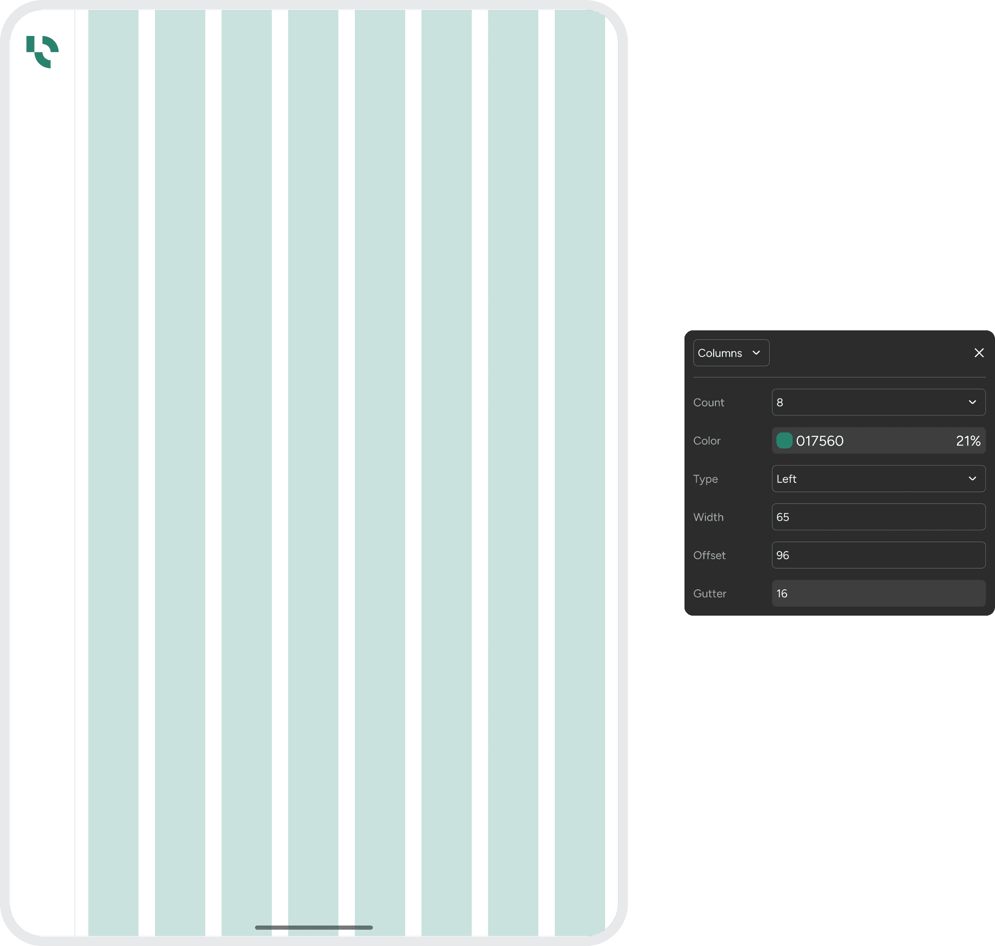
Columns – The vertical sections in a grid that guide alignment for text and elements. In Figma, you can control how many columns and how wide they are.
Margin – The space on the left and right edges of the layout. It gives content breathing room and keeps it visually balanced.
Gutter – The space between columns. It separates content and improves readability.
Base Value
Start your grid by picking a base value, the smallest unit everything else builds on. All spacing and sizing should be divisible by it to keep things consistent.
The most common Base values used are:
4pt Grid – Everything is based on 5px (All spacing and sizing should be divisible by 4).
5pt Grid – Everything is based on 5px (All spacing and sizing should be divisible by 5).
8pt Grid – Everything is based on 5px (All spacing and sizing should be divisible by 8).
Which one should you choose?
4pt grids for the win!

Benefits of choosing a 4pt Grid
The 4pt grid system is a way to keep spacing and layout consistent by using values like 4, 8, 12, 16, 20, 24, and 28 pixels. This makes designs look cleaner, helps developers and designers stay on the same page, and avoids blurry lines on high-resolution screens. It also makes it easier to align elements and create a balanced layout. Many popular design systems like Material, Ant Design, and IBM Carbon use this approach to keep their interfaces organized and easy to scale.
Sometimes, you need a bit more control, especially with small elements like icons or text. That’s where the 4pt step comes in. It lets you fine-tune spacing while still keeping everything in harmony with the overall grid. It’s often used for line heights, padding inside small components, or tighter layouts. In short, the 8pt grid brings structure, and the 4pt scale helps you fine-tune the details. Together, they make your designs both clean and precise.
Fixed Grid vs Fluid Grid
A fluid grid sets fixed margins and gutter widths, then adjusts the column widths to fit the screen. Columns may vary in size, but gutters keep everything aligned. It’s a popular choice for responsive design across different devices.
A fixed grid uses set widths for both columns and gutters. On wider screens, it leaves blank space on the sides, great for websites and news portals where stretching content too far can hurt readability.


Soft Grid
A soft grid uses a base number and its multiples to align everything… margins, padding, spacing. It’s more flexible and easier to implement in both design and code, especially in mobile apps. Elements within a component stay close, while separate components are spaced farther apart. (more on this later in the course).
For Vertically aligned items, and for the components themself, we follow the soft grid.

Screens & Breakpoints
The most common screens you will be designing for.
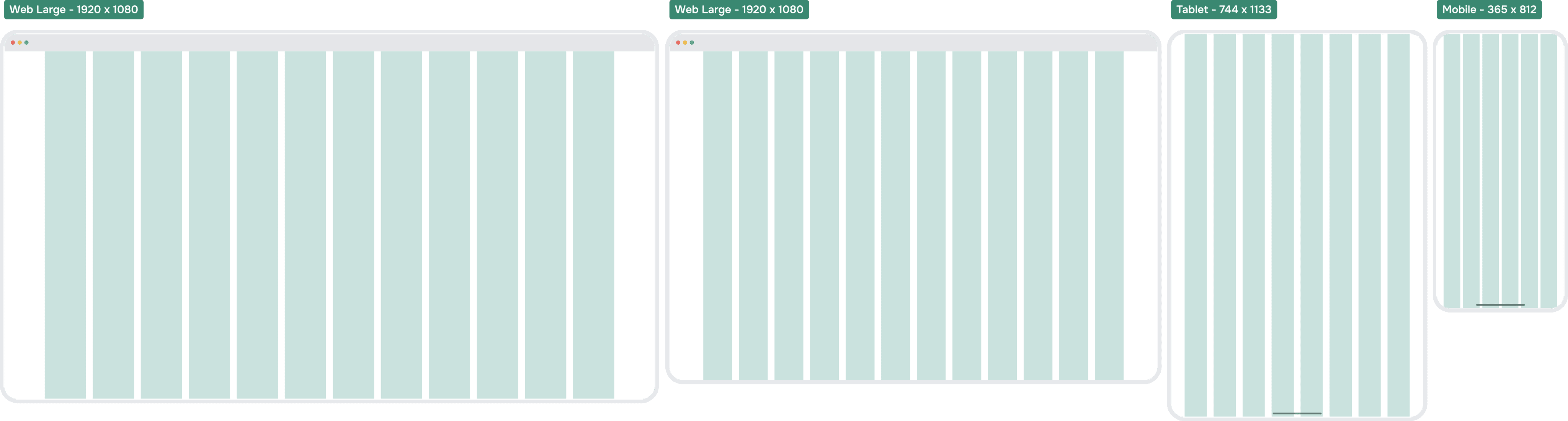
Web Grid Setup - 1440 x 1024

Web - Dashboard Expanded Navigation - Grid Setup - 1440 x 1024

Web - Dashboard Collapsed Navigation - Grid Setup - 1440 x 1024

Tablet - Grid Setup - 744x1133

Tablet - Dashboard - Grid Setup - 744x1133
Mobile - Grid Setup - 375 x 812

Mobile Safe Zone
On mobile, it’s important to consider how far the thumb can reach.
If the layout is scattered or poorly structured, using the app with one hand becomes frustrating.
Most people hold their phone in one hand and rely on their thumb to navigate—so design accordingly.For Vertically aligned items, and for the components themself, we follow the soft grid.

